
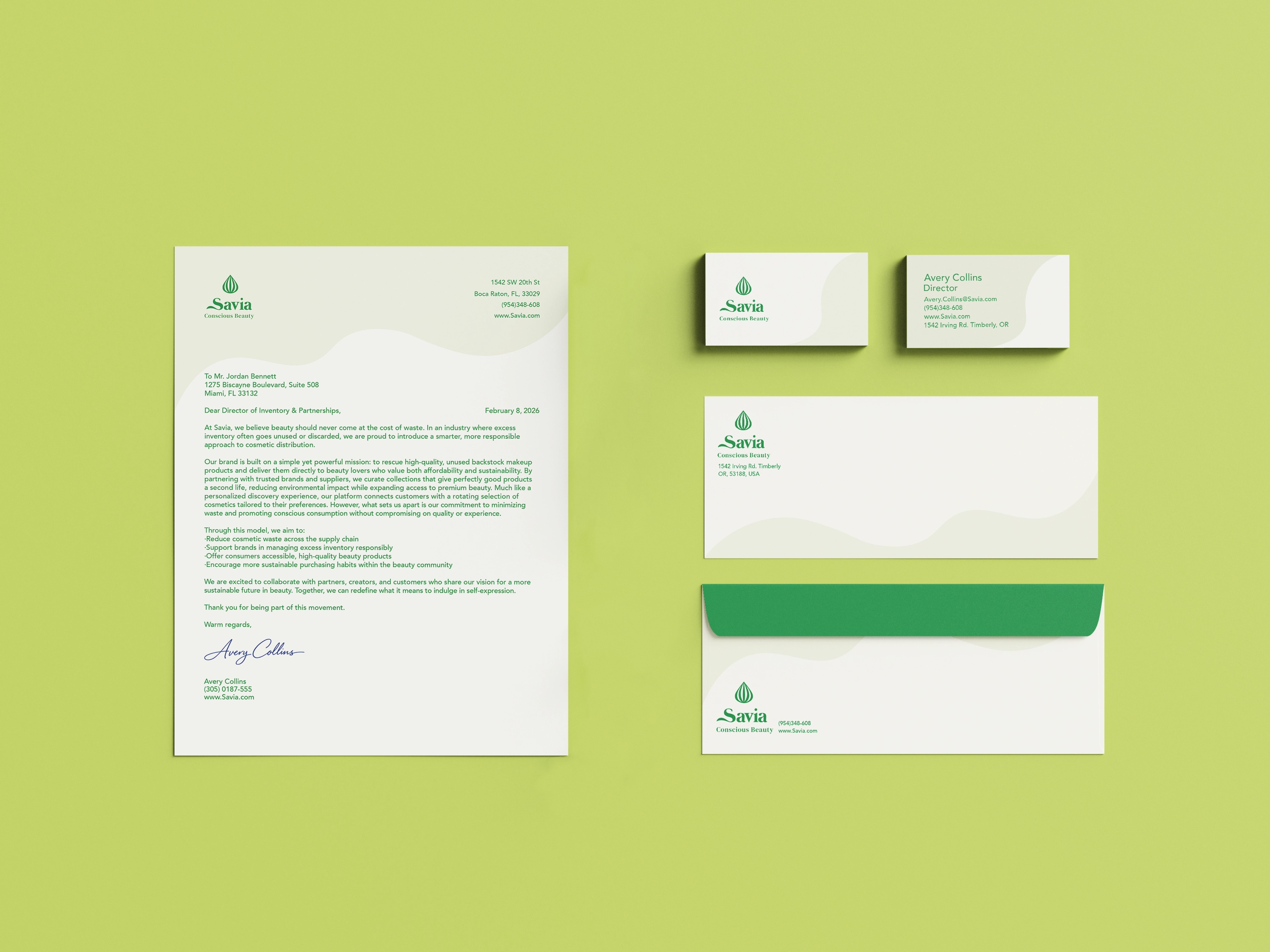
Savia Logo & Stationery
8.5 x 11 inches
Savia sells and distributes unsold surplus makeup. The logo was designed to represent a seed. The seed is meant to communicate the revitalization or “growth” of makeup as the goal is to give makeup another life. The dominant green color and the seed motif convey the brands' dedication to environmental preservation and conscious beauty. Sans serif type is used in contrast with the serif heading as it creates a more dynamic appearance. The Serif type contrasts and draws more attention contributing to the principles of hierarchy. Background patterns, as seen on all three stationary items, are inspired by the flow of foundation.